JADU®
Brand Guidelines v1.0
JADU®
FIGHTING GAME
FROM THE FUTURE
0.0 — INTRODUCTION
JADU® is a first-of-its-kind multiplayer augmented reality fighting game for mobile (iOS & Android).
Think Street Fighter but in the real world. Players control their avatars in the physical space to remotely fight others in intense real-time PvP clashes. You can build your avatar, start rivalries with friends or compete against strangers for glory in this fighting game from the future.
0.1 — JADU® LORE & CHARACTERS
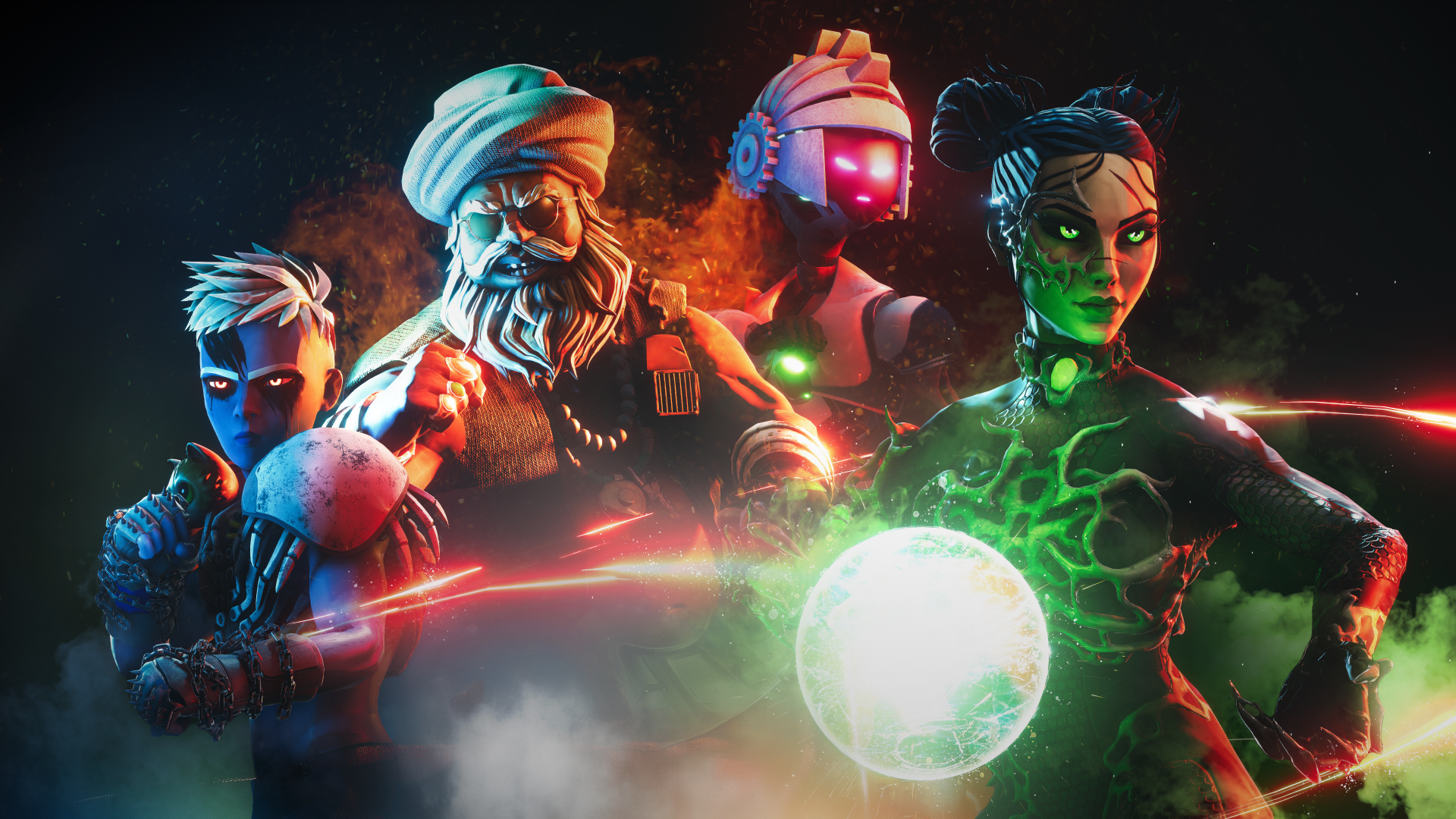
Set in a gritty alternate reality where an alien robot race, AVAs, has engulfed our world in an aurora of mutation known as the Bloom. This radiance has reshaped Earth & has given birth to a new life form - Bloombornes. Players fight as Bloombornes, humanoid entities infused with radioactivity and filled with a primal urge to prove their supremacy.
Among these fighters are ChaCha TukTuk, a gritty and powerful truck driver from South Asia whose raw strength and resilience make him an unstoppable force, and Absynth, a poison-based femme fatale who uses her deadly grace and toxic abilities to dominate the arena.
Build your Bloomborne, start rivalries with friends or compete with strangers for glory in this fighting game from the future. With next-gen AR gameplay and real-time multiplayer fighting, Jadu redefines what mobile games can be.

1.0 — jadu® Logo
Our logo embodies the spirit and energy of our AR fighting game. Bold and distinctive, it captures the essence of our brand and should be prominently featured in all communications (wherever possible). This part also covers the JADU® Logo's usage.
1.1 — color
Our logo may be used only in JADU® White (mostly) or JADU® Black (rarely). The “Color” section provides more information about these colors.
If your background is dark (which is usually the case), use the logo in JADU® White. If your background is white, you may use the JADU® Logo in JADU® Black.
You are only allowed to use JADU® White over photos and cinematics, ensuring that it is clear and legible (typically achieved through an overlay).

1.2 — clearspace
To preserve the integrity and legibility of the JADU® logo, a designated clear space should always be maintained around it. This clear space is defined as the height of the letter ‘J’ in the logo, ensuring that no other elements encroach upon this area, allowing the logo to stand out clearly and unobstructed.

1.3 — sizing
The JADU® logo should be displayed at sizes that ensure readability and visual impact. Minimum and maximum size guidelines are established to maintain consistency across different applications, whether on digital platforms or physical merchandise.
Our logo's minimum height should be at least 16px on-screen and/or 0.25 inches in print.

1.4 — lockups
Logo lockups involve combining the JADU® logo with other elements such as taglines, partner logos, or graphic symbols. These lockups should adhere to specific configurations to maintain a balanced and harmonious visual composition.

1.5 — USAGE
Practical examples of correct logo usage demonstrate how the JADU® logo should be applied across various contexts, including digital interfaces, print materials, merchandise, and promotional content. These examples serve as a reference to ensure uniformity and brand consistency.
2.0 — jadu® SYMBOL
The JADU® symbol was created to serve as a gateway into augmented reality. It has been in use since JADU®'s inception and is now featured on our digital collectables and apparel, among other items.
The JADU® symbol should only be used in places where there is not enough space for the full JADU® logo.
2.1 — evolution
The symbol of JADU® has evolved from its conceptual roots to its current form, embodying the essence of the game’s narrative and aesthetic.

2.2 — usage
The JADU® symbol is only to be used in locations where there is insufficient space for the full JADU® logo. Good examples are favicons or JADU®'s presence alongside SoMe icons.
Besides general communication, the JADU® symbol is always present on all our digital collectibles.
3.0 — jadu® colors
The color palette of JADU® is a vital component of its visual identity, conveying the game’s futuristic and dynamic essence. Our color system is designed to provide a wide range of expressive and functional options, ensuring consistency and versatility across all mediums.
This section outlines the different colour palettes used in JADU®, including a monochrome palette, and a spectrum derived from our unique 15-degree angle grid. Each palette plays a crucial role in defining the visual tone and enhancing the immersive experience of JADU®.
3.1 — monochrome
JADU®’s monochrome palette consists of four primary tokens accompanied by 10 shades of black and white, providing a versatile range of tones for different design needs. This palette supports our dark aesthetic while offering flexibility in creating depth and contrast.


3.2 — spectrum
Colors in the JADU® spectrum are meticulously chosen based on a 15-degree angle grid to ensure a harmonious and cohesive color scheme that aligns with the game’s futuristic and dynamic visual style.
Extracted values can then be layered with different blending modes to create new variations and support "JADU® Treatments".

3.3 — extended
Colors from the spectrum are vibrant and bold, suitable for special events, promotions, and in-game highlights, adding dynamism and excitement to the brand.

4.0 — jadu® typography
Typography is a cornerstone of JADU®’s visual identity, playing a critical role in communicating the game’s tone and enhancing its aesthetic appeal. Our typographic choices are carefully selected to ensure readability, consistency, and a distinctive look across all platforms and media.
4.1 — typefaces
JADU®’s typographic choices include Druk Medium, NT Bau Regular, and Joyride. Each font is selected to complement the game’s visual identity, providing a balance of readability and stylistic flair.

4.2 — text styles
Text styles within JADU®’s brand include headings, subheadings, body text, and captions. Each style is defined by specific attributes such as size, weight, and spacing to ensure consistency and clarity in all written communications.

4.3 — usage
The typographic skeleton creates the basic framework for organizing and displaying different text elements in a logical and accessible manner. This hierarchy is detailed in the internal design system at JADU®.

4.4 — custom
For special occasions, custom type is designed specifically based on the JADU® angle grid. This unique typeface strengthens the game’s distinctive visual identity and adds a personalized touch to the brand's typography.

5.0 — overall usage
Practical examples of overall brand execution illustrate how all elements of the JADU® brand come together cohesively. These examples span various applications, showcasing the versatility and consistency of the brand across different platforms and media.


6.0 — conclusion & DOWNLOADS
Adhering to these standards ensures that JADU® remains a distinctive and memorable player experience. Download the complete available brand assets to access all the necessary resources for implementing these guidelines.
Please reach out to design@jadu.ar if you have additional questions.

Browse →
Jadu AR Inc. / 2024
Designed with love by the department of design at JADU®.